Project
01
Overview
02
Problem
Managing personal finances can be overwhelming. Many people struggle with tracking their monthly expenses, and existing tools often complicate the process with cluttered interfaces and excessive features, leading to frustration and financial mismanagement.
Solution
To address this, I designed a mobile app that simplifies expense tracking. The app features a clear, straightforward user interface, making it easy for users to manage their finances without confusion or stress.
Research
03
User research —
findings & insights
To understand user behavior and pain points, I did a small survey with 14 participants. Key insights guided the app's design and functionality. Here's what I uncovered:
59%
Of respondents are hesitant to link their credit cards to start-ups for automatic expense updates
This reluctance stems from concerns about trusting newly established companies, especially those without established reputations or reviews.
78%
Found other expense management tools confusing and overwhelming.
Most participants felt that existing tools on the market were unclear and lacked straightforward navigation, leading to frustration and a poor user experience.
From Insights to
Action
Building on these insights, I crafted the user flow. This visual map outlines the journey users take within the app, ensuring a logical, efficient, and user-friendly experience from start to finish.
Logo design
04
Building a
Visual Identity
To complement the app's purpose and user experience, I designed a logo that captures the essence of Expend while remaining visually cohesive with the app's overall aesthetic.
Typography
I used Baloo font, which is a rounded, playful typeface. This font was chosen to convey a sense of approachability and ease of use.
Colors
For the colors, I chose light purple for the 'X' and the underline, to evoke a soft, calm feeling, fostering trust and dependability. The very dark purple for the other letters adds a professional tone, reinforcing the app’s reliability as a financial management tool.
Consistency
05
Creating a Simple
Design System
To ensure a consistent user experience across the app, I developed a straightforward design system. This system includes key reusable components such as spacing, colors, font sizes, and UI elements, which help maintain uniformity throughout the app’s interface.
Mid-Fi
06
Medium Fidelity
Wireframes
To refine the app’s interactions and user flows, I created 53 medium fidelity wireframes. These screens outline the mobile version of the application, providing a foundation for user testing and further iteration.
Testing & Iterations
07
Usability Testing,
Findings & Iterations
After creating the wireframes, I wanted to ensure the app's design was user-friendly and intuitive. To do this, I conducted a usability test with 6 participants. The goal was to evaluate the clarity, ease of use, and comprehension of the app's features. Based on their feedback, I made several key iterations to improve the overall user experience.
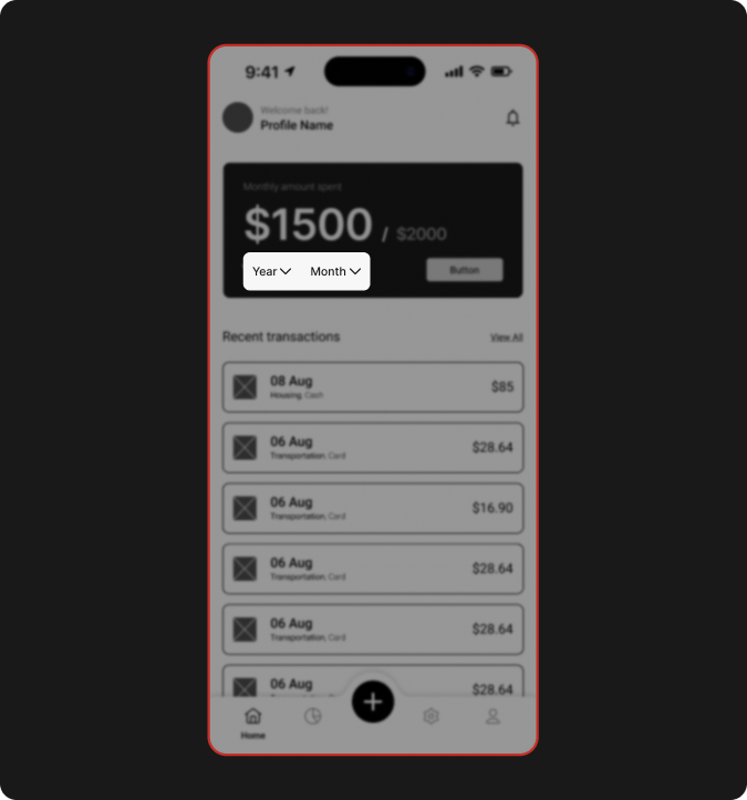
Before
On the home screen, users had to manually select both the year and month to view expenses, which required multiple clicks.
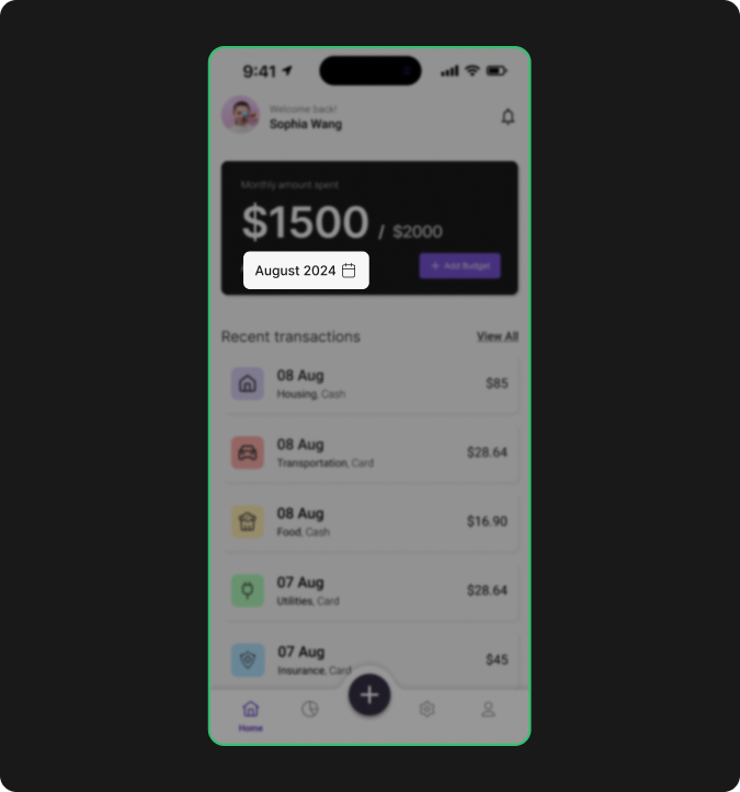
After
I replaced this with a single button displaying the current month and year (e.g., "August 2024") alongside a calendar icon. Tapping the button now opens a calendar for easy selection.
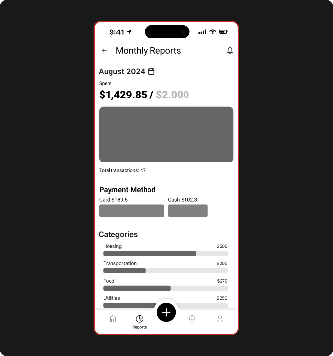
Before
The monthly reports screen was cluttered, with separate sections for total expenses, payment methods, categories, and filters, overwhelming users with too much information at once.
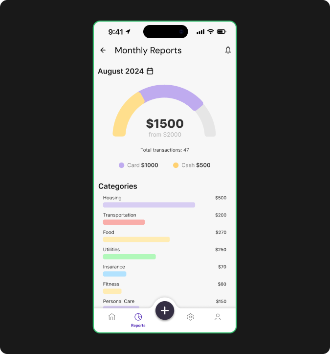
After
I streamlined the layout by merging payment methods into the monthly expenses section, displaying the total amount first, followed by transactions, and then payment methods.
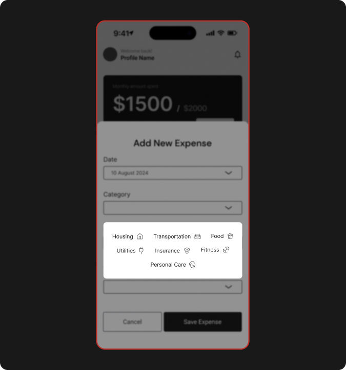
Before
When adding a new expense, users had to choose from 7 predefined categories, with no option to create a custom category.
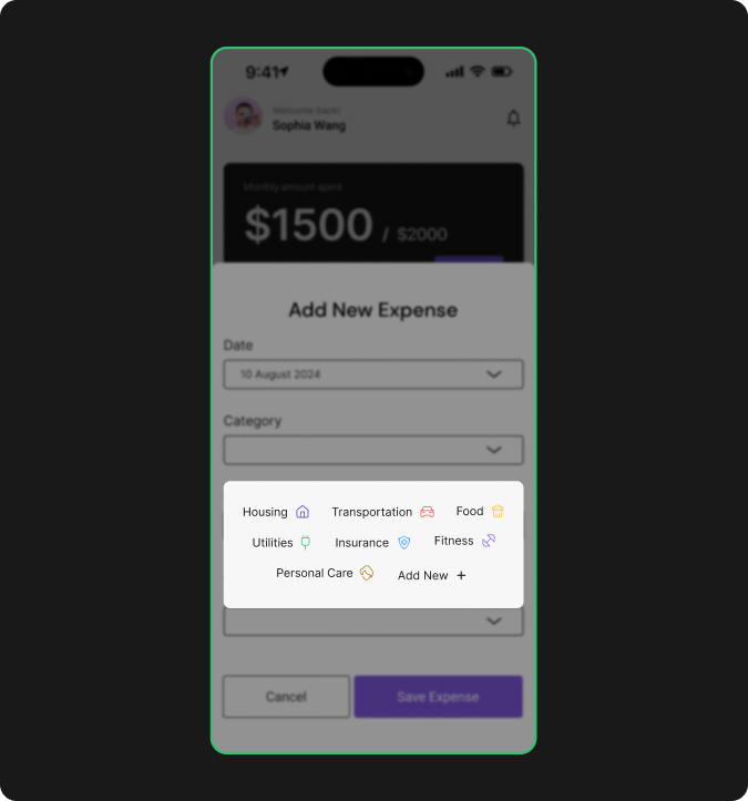
After
To adress this, simply i added an “Add New” button to allow users to create their own categories, providing more flexibility in managing expenses.
Prototype
08
Bringing It All
Together
After incorporating feedback from usability testing and refining the design, I created an interactive prototype to showcase the final product. Feel free to engage with the live prototype below.
Lesson learnded
09
What I learned during
the Project
Through this project, I gained invaluable insights into the importance of user research and design systems. Conducting surveys and usability tests not only informed my design decisions but also highlighted how critical these processes are for creating an effective user experience.
01
Research and testing play a crucial role before and during design.
Even a small survey revealed insights I hadn’t anticipated. Additionally, usability testing highlighted features and issues that needed improvement, enhancing the overall user experience.
02
A design system can significantly streamline the design process.
By creating a system with reusable elements, I accelerated the design process and ensured consistency across the application, reducing user confusion.